Schedulicity launched a major rebrand this January in a move meant to nod to how far the company has come — and how much it owes to its roots and the service-based businesses that built it.
Among other changes around the site and Schedulicity’s consumer and business apps, you’ll find a bold new color palette and a sleek logo that’s worthy of 2020.
“Over the last few years, our company has grown astronomically,” says the Schedulicity team. “We’ve expanded our team, built new features, improved and updated the elements you love the most. We wanted to re-up our commitment to what brought us here in the first place.”
Schedulicity’s Design team decided it was time to stop thinking in terms of scheduling and instead consider Schedulicity as “a whole package”—the one tool that every successful entrepreneur needs. The result is a new look that nods to both the company’s unconventional origin story (Schedulicity started in and still operates out of Bozeman, Montana) and its dedication to building more human connection into every shave, haircut, and workout session.
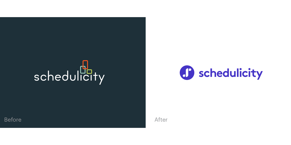
The most significant change is the new logo. Cleaner and bolder, it’s full of meaning. “Schedulicity is the path to success for businesses, as well as the conduit for connecting to consumers,” says Schedulicity’s VP of Design, Kyle Meehan.
“The two outer shapes might look familiar to you if you spend a lot of time navigating your city — they represent markers on a map,” says Meehan. “The middle shape nods to a flowing river, our visual for the relationship that connects you and your clients together.” The color palette, nods to the humble backdrop of Montana, a state known for its people.
“We have a connected community here where everyone supports and cares for each other,” says the team. “When we launched Schedulicity, we wanted to build that sense of community everywhere. It’s why we pride ourselves on offering the best customer support in our industry (shout out to our Rockstars!) and why we started #SchedulicityCares.”
The team realized a one-color brand wouldn’t feel true to the diversity of Schedulicity’s businesses. So they turned to other Montana-inspired hues, from the wide-open plains to the ice-cold rivers. The new primary color is huckleberry, which is inspired by the huckleberry pie you can find in every local cafe. Then there’s Pine. Slate. Trout. Bitterroot.
Beyond the color changes, expect more glimpses into the businesses that built Schedulicity around the site and in the company’s advertising. “We are people first, and we pride ourselves on that,” says the team. “We want to show more of the people who helped build us within our brand.”
The human support you love isn’t going anywhere. The beloved Schedulicity features like automated marketing and Schedulicity Pay are staying put, too. The goal is to deliver the best service in the most authentic way. “We’re still us,” says Meehan. “We’re just aiming to do it in a way that feels distinctly, perfectly us.”